Colorado's Down-Ballot Data Visualizer
Explore the State of Colorado's proposition and amendment races.
Understanding how votes add up matters. It matters for big races, but it matters for smaller, down-ballot races too.
The Colorado down-ballot vote visualizer is a tool to be used in the pursuit of understanding down-ballot voting trends in Colorado races. The visualization tools this site offers are meant to lend a hand to journalists covering these races and to voters seeking more information about how support for state-level issues has changed over time.
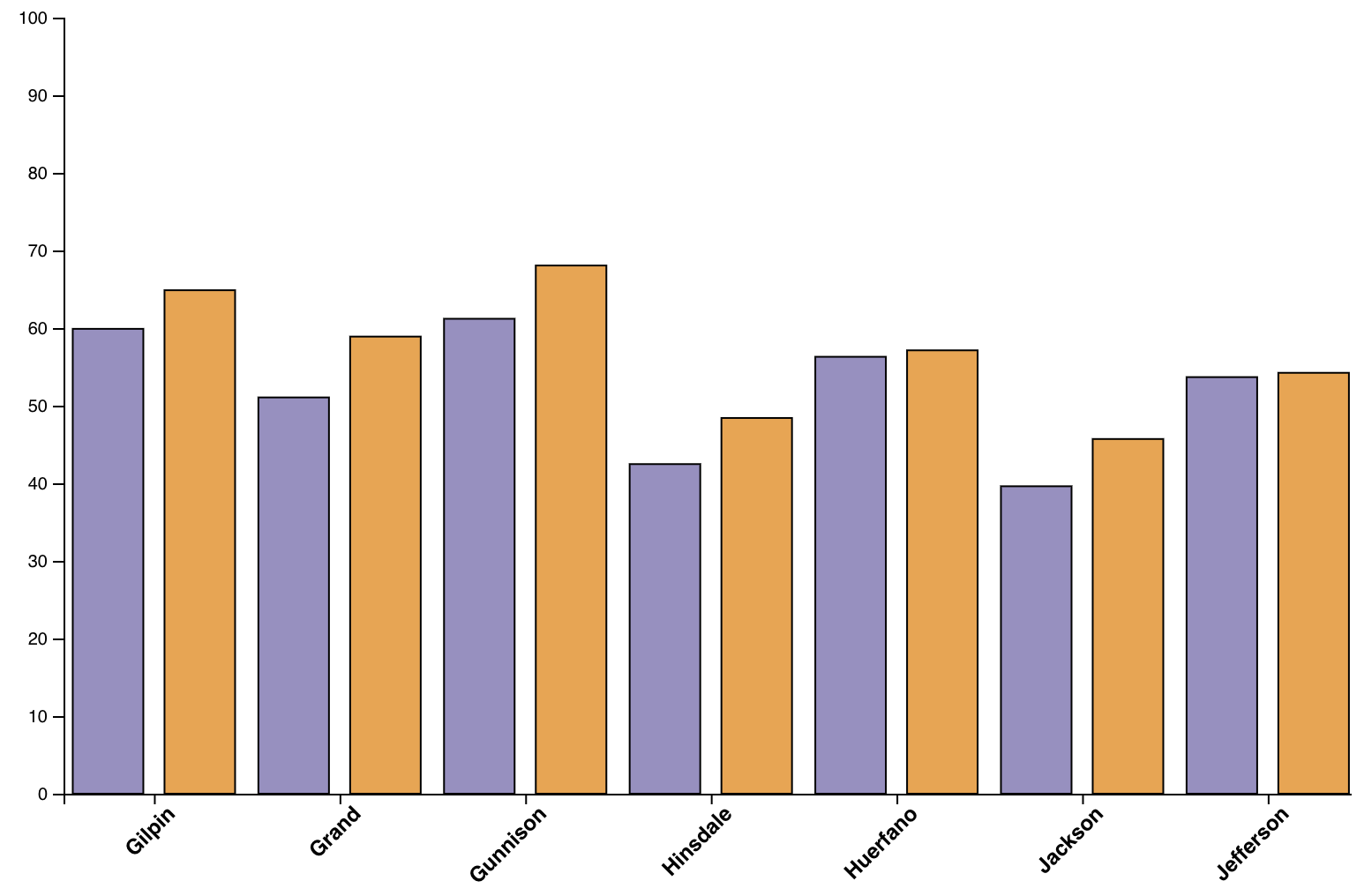
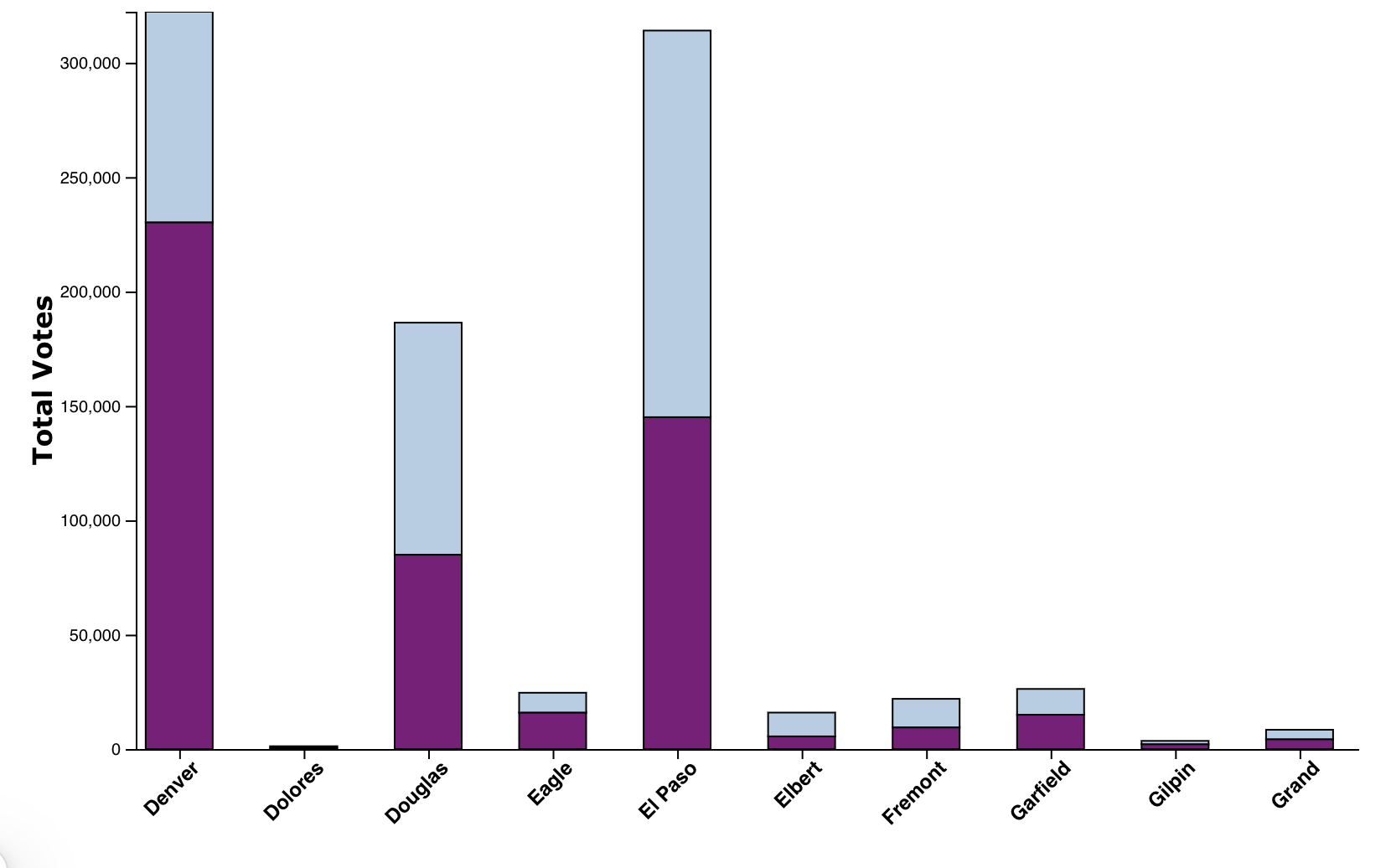
The County Level Pass/Fail Density Map allows users to search by year and proposition to see the density of support for a given proposition by county. The Proposition Comparison visualizer allows users to pick two separate years and two propositions within those years. This visualization aims to support users comparing two similar propositions on a county level to see how the level of support within counties has changed over time. The County Level Pass/Fail Histogram visualization allows users another way to think about county level support for propositions.
These visualizations can be exported in their entirety and used in local election reporting. All the data for these visualizations comes from the Colorado Secretary of State's elections data. Find out more about how this data was sourced here.


